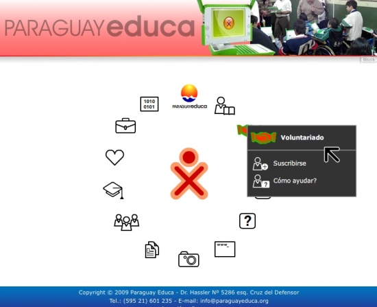
Love it or hate it, the Sugar Learning Platform graphical user interface is strikingly different from any of the usual windowing desktops. With this radical departure from the norm, we've seen much discussion. And while my favorite interpretation is Aquatic Sugar, the new website from Paraguay Educa comes in a close second:
If you go to the website, you'll quickly notice that your cursor changes to the XO style cursor and each icon launches a drop down menu, just like the XO. And while the rest of the site is basic Flash, I do like this introduction. You're thrust into the Sugar world right from the start.


Hola!
I will be bringing down my XO to Cali, Colombia for my son who will be 18 months next month. He already bangs on the keyboard and uses the mouse when my wife communicates via the desktop there. Hopefully, the website will assist her in handling the XO, since she knows Spanish and my son is still learning English and Spanish!
I recently interviewed an OLPC developer, Bernie Innocenti, about the accomplishments of OLPC in Paraguay due to continuous, close relationships between OLPC developers and end users:
http://stop.zona-m.net/education/proposal-olpc-paraguay-how-manage-sugar-or-other-educational-software
HTH