As much as Nicholas Negroponte shocks me with his dismissal of One Laptop Per Child pilot projects or empirical testing of Children's Machine XO educational impacts, I do agree with him when it comes to the actual OLPC XO laptop. In an email interview with the Associated Press, Negroponte wrote
"I have to laugh when people refer to XO as a weak or crippled machine and how kids should get a 'real' one. Trust me, I will give up my real one very soon and use only XO. It will be far better, in many new and important ways."As I've said often I'd love an OLPC XO too! From the amazing dual-mode screen to the instant suspend/resume, the laptop is a revolutionary leap in computing technology. Technology that comes in a stunningly cute XO-1 form factor.

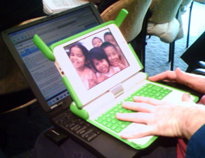
OLPC XO on a 12" screen laptop
And I am not the only one impressed by how small, light, and visually compelling the One Laptop Per Child, Children Machine XO is. Tiki Robot is also impressed, and they have an entire Flickr pool to compare it to a standard-sized laptop.
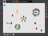
While you're ogling the images, think of using such an amazing yet tiny computer. Or better yet, how comfortable a child will be with the diminutive keyboard yet enlarged screen. A screen showing the clock-stopping hot Sugar user interface that I'm quoted about in the same AP article:
OLPC powerbook resolution 1200×900 1024×768 dimensions 6″x4.5″ 9.6″x7.3″ dpi 200 106
[Wayan] called Sugar "amazing -- a beautiful redesign. It doesn't feel like Linux. It doesn't feel like Windows. It doesn't feel like Apple," said Vota[...]And now we have an official OLPC press release about Sugar. There you can learn how its different yet similar to operating systems you use today:
"I'm just impressed they built a new (user interface) that is different and hopefully better than anything we have today," he said. But he added: "Granted, I'm not a child. I don't know if it's going to be intuitive to children."
Sugar is modeled after a typical, modern-day operating environment, but with key modifications:Now if you want to read objective user reviews, then check out the Sugar UI review, the Sugar emulation or better yet, emulate it yourself No matter what you do, be sure to discuss the Sugar UI usability.
Typical Sugar Desktop Neighborhood Menu bar Frame File system Journal Applications Activities Files Objects In Sugar, the interface hosts four discrete views: home, friends, neighborhood and activity. Each of the views relates to a particular goal of the OLPC project and enhances learning by fostering communities and social networking, and by enabling access to large repositories of knowledge such as Web sites, and school or community
servers.


One thing - besides the other advantages listed by Wayan - which I find attractive about the XO: Its incredibly low power consumption. With such a machine you really don't have to have a bad conscience when you leave your computer on all day!
FrF,
Power consumption would be the instant suspend/resume I mention. They are talking about turning off the CPU _between_ keystrokes. That means a computer using only 3 Watts, not 150+ for normal computers and 30 Watts for the most energy efficient current computers.
The Sugar gui is different and better for a lot of purposes partly because it was designed from the bottem up for collaboration. Standard gui's like Windows are designed for stand-alone opperation and collaboration gets added in only as an after-thought and so doesn't work very well. For Sugar it was a key goal from the beginning, and so it works much better.
I have been thinking that this is a revival of the original unix idea. From what I understand, unix was originally designed for collaboration, with many terminals connected to a single server so that different people could work on the same file.
With pc's this was lost as they were originally designed for hobbiests to use at home. Networking like for bbs's was added in, and then the internet. However, for real collaboration you need to have two or more people looking at the object they are working on in real time, communicating with each other in real time, and making changes to the object in real time that they all see instantly. The internet has only, like with broadband and Ajax, gotten the capability to do all this (hence Web 2.0), but with Sugar it is designed in so that it can be done with far less hardware and bandwith.
Oh, and I recall that the original Doug Englebart "mother of all demo's" included remote collaborative editing. So maybe we are finally starting to see the real promise of collaborative computing.
For more on Sugar this is super-informative:
http://wiki.laptop.org/go/OLPC_Human_Interface_Guidelines
The Sugar gui is different and better for a lot of purposes partly because it was designed from the bottem up for collaboration. Standard gui's like Windows are designed for stand-alone opperation and collaboration gets added in only as an after-thought and so doesn't work very well. For Sugar it was a key goal from the beginning, and so it works much better.
I have been thinking that this is a revival of the original unix idea. From what I understand, unix was originally designed for collaboration, with many terminals connected to a single server so that different people could work on the same file.
With pc's this was lost as they were originally designed for hobbiests to use at home. Networking like for bbs's was added in, and then the internet. However, for real collaboration you need to have two or more people looking at the object they are working on in real time, communicating with each other in real time, and making changes to the object in real time that they all see instantly. The internet has only, like with broadband and Ajax, gotten the capability to do all this (hence Web 2.0), but with Sugar it is designed in so that it can be done with far less hardware and bandwith.
Oh, and I recall that the original Doug Englebart "mother of all demo's" included remote collaborative editing. So maybe we are finally starting to see the reall promise of collaborative computing.
For more on Sugar see:
http://wiki.laptop.org/go/OLPC_Human_Interface_Guidelines
Oops, sorry about the double post.