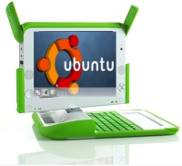
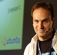
In May I talked about Ubuntu's Netbook version over at my personal blog, which is designed specifically for the ultraportable, "4P Computing" market. Mark Shuttleworth (Canonical's CEO, the parent company behind Ubuntu) just posted more about the interface design for the "netbook" market:
Almost universally, they've [OEMs] asked for standard Ubuntu packages and updates, with an app launcher that's more suited to new users and has the feeling of a "device" more than a PC.The Asus Eee's "basic" mode had a very device-like feel to it and has done reasonably well with it's Xandros Linux backend, and with Ubuntu's star performance as a Linux desktop for the masses, I can only imagine the UX (User eXperience) will be even better, and the review of the current product at Ars Technica sums it up as:
The implementation is, overall, quite ingenious in many ways, but there are still places where it feels a bit clunky. The project is clearly early in its development and we will likely see the rough spots even out as it evolves.Beyond just a more device-like application launcher and a tabbed window structure; Mark also mentions "two companies that want more radical user interface innovation":
Canonical is participating directly in the design and implementation of one of those UI's, and we're integrating someone else's UI on an Ubuntu base for the second project. I haven't seen either of those UI's, for confidentiality reasons, but I'm told that the teams working on them think they have great ideas that will elevate, in different ways, the state of the art.

Now, you've got to wonder who those companies are. Could it be Walter Bender's Sugar Labs? Mary Lou Jepsen's Pixel Qi? Sugar is definitely an innovative UI, and PixelQi's tagline is "The future of portable computing is all about the screen," with a strong focus on holistic computer design and user experience. Other candidates could be OEMs like Quanta (which was planning to produce its own version of the XO laptop.
No matter who it is, Mark concludes;
All in all it will be exciting to see how the netbook era stimulates innovation in the Linux user experience, because there are a lot of companies wanting to build differentiated UI's on a standard Linux base. And directly or indirectly Canonical will help to bring that innovation to KDE and GNOME and hence to the wider Linux ecosystem.With any luck, the 4PC market that the OLPC has helped to create will also spawn a new round of UI considerations which traditional software companies (Microsoft and Apple) will be interested in designing for as well, creating functional but light-weight versions of their OS (WinCE hardly counts, Apple's iPhone OS might be a sleeper candidate however).


you know i think its somewhat ironic that the XO uses linux, since i think, just like the linux community, we are going in all different directions. people are debating who this machine is for, how it should be used, and what the philosophies behind the machine should be. therre are many different opinions on these various subjects, the various combinations are so vast that it leaves us in a state of confusion. as a result, we are unorganized. I find this rather comical since we sound just like the linux community. all those different ideas going in so many different ways that it left what could be a powerful community, a rather weak one. finally mark shuttleworth came about and changed that. he had an idea and he had resources. the two has allowed linux to become something that it would have never become on its own without help from a visionary with moolah. basically, linux needed its own version of steve jobs or bill gates.
I think that the same thing applies to the XO project. we needed someone on the software side to organize us and put us in a direction that will work out in the long term. The project also needs money...how much does the recently branched out sugar labs currently have? you cant really make a living off of good intentions. I had completely forgotten about this version of ubuntu and i hope that the ubuntu, sugar labs, and the Canonical (should i know of Canonical??) UIs come eventually fuse together, using the only best (the parts that people find most intuitive and useful) parts to create an innovative "super UI."
i would ask about how efficient the OS will be under the hood, but then i remembered i installed hardy heron on a 10 year old pc last year and it ran rather well. things might need to be modified/added specifically for the XO, but i think overall it should be pretty damn efficient.
Sugar and Ubuntu Mobile (MID) are quite different. Ubuntu Mobile has a more device-like UI (user interface) while Sugar tries to be a sort of reinvented desktop for children.
Ubuntu Mobile is EXACTLY what OLPC should have done instead of Sugar:
- Not trying to reinvent the wheel with the base UI, it is based on MobLin developments (Linux for Mobile Devices). The menu and base desktop strongly resembles other desktop and mobile UIs (e.g. you see the network status on the taskbar...etc)
- Standard applications, not forked, stripped-down & renamed ones (Abiword, Gnumeric, Evince...etc)
- Everything assembled for decent Internet access and services (Firefox, Java, Flash) into a usable package
I think children would be fine with Ubuntu Mobile on the XO. In fact most G1G1ers would opt for it, if it was available for the XO with power management.
It would be nice if the second company was OLPC and/or Sugar Labs.
Umm... Anyone noticed that Ubuntu Mobile UI looks specifically targeted for touchscreen devices? In Sugar giant buttons are the result of interface simplification, however in Ubuntu Mobile it's actually the goal in itself -- UI elements large enough to be used on a touchscreen without a stylus. Does https://wiki.ubuntu.com/MobileAndEmbedded/UIStyleGuide look simplified?
For me it looks like a major departure from traditional desktop UI, but direction is nowhere close to one of Sugar, it's more like PalmOS or iPhone -- PalmOS being designed for extremely low resolution and stylus-only input, iPhone being the first touch-only interface on a moderate-resolution screen (behind flashy iPhone graphics is a 320x480, half-VGA screen!).
In most respects, I don't blame them for wanting a simpler UI on the XO. There are a lot of features that very few people will ever use. Even among the useful features, there are a lot of features that can be accessed multiple ways. For example, excluding keyboard shortcuts, there are three ways for me to go back a page (the button bar, the menu bar, and the popup menu). Keyboard shortcuts add at least two other ways to complete that process. It is also possible to use the history mechanisms to accomplish the same thing. The same thing can be said for bookmarks: you have the bookmark bar, the bookmarks menu, the bookmark manager, and the sidebar. All of this nonsense makes it harder for an experienced adult to use computers, nevermind a child who has rarely had experience with computers (or an adult technophobe).
I think that their motivation was in the right place, but their execution sucked. Rather than building the interface from the ground up, they should have taken existing software and stripped it down. It would have been faster, more practical, and likely more reliable.
@teapot : I think it's possible; and certainly they designed it to support touchscreen/stylus interaction, as a lot of the tablet PCs could run this version. But also look at the Asus Eee "simple" mode - big, clear buttons for the most popular apps. I think it's just optimizing for smaller screens in general; I don't want to navigate a cascade-menu, and even the taskbar launch buttons would be less than easy to navigate to on a smaller screen.
@sola: "I think children would be fine with Ubuntu Mobile on the XO. In fact most G1G1ers would opt for it, if it was available for the XO with power management."
The trouble is, children != G1G1; geeks == G1G1. Having used Sugar for around six months now, I don't find it a *bad* interface. The 8.2.0 version looks to be even better. (But I've not actually used that.)
The biggest problem I've had with the concept of "Sugar is for children" is how often (with builds 656 and 703) it's necessary to drop to Terminal to accomplish things, often having to "su" as well. It's my understanding that this is being addressed to some extent in 8.2.0 as well -- things like set timezone won't require leaving the Sugar environment. When mandatory dropping into Terminal becomes a once-a-month thing instead of once-an-hour, then the XO will have been made "kid friendly".
Sugar is a work in progress. Its target is *not* linux expert power-users and road warriors. (Despite that, I just spent a week using my XO while traveling and it performed just about as well as the Dell Inspiron running XP that I used on my last trip.)
Must we continue to be bombarded with articles about how "The XO would be a great machine if you would only rm -r and install [your favoirite OS here]"? To quote a deceased actor, "My God, man, stirring a person's brains with a knife is not the answer." Whether it be another linux desktop distro, Windows, OS/X or whatever, these are *different* operating environments, not necessarilly *better* ones.
"Rather than building the interface from the ground up, they should have taken existing software and stripped it down. It would have been faster, more practical, and likely more reliable."
They DID strip it down. GUI toolkit is the same GTK as in all modern GUI applications for anything unixlike, except those that use Qt. General-purpose applications for XO (document editor, PDF viewer, web browser, ...) are basically mainstream applications with parts of UI replaced with Sugar. There are also "sugarized" applications that are regular Linux binaries launched within Sugar (ex: Opera).
However my point is not even about that -- it's that Sugar UI is simplified (strict adherence to toolbar model, minimal menus, no popup windows, no user-visible global setup) while Ubuntu Mobile follow iPhone design goals (keep UI complex and all functionality accessible while the user has nothing but tips of his fingers on a half-VGA screen to perform all interaction). When I ported regular Ubuntu to XO, the only changes in interface that I had to make were "fake" DPI (half the real DPI, so resolution-dependent elements are larger), widened scrollbars (so they are easier to grab and drag with a pointer) and themes/icons colors.