While thinking about some of the recent stories on the over-hyped Windows XP on the XO I realized how ridiculous it seems for anyone to get excited about an operating system released in 2001. An operating system that is the successor of Windows ME!
So instead of going down memory lane and mocking Microsoft I decided to compile a little overview of a cutting edge Sugar demo that I was shown when I was at OLPC HQ in Cambridge, MA some weekends ago. The demo setup was prepared by Alex, an intern at OLPC, and its goal is to show off some of the cool features that you can get to use on your XO when you spend some time tweaking the thing.
It is based on the latest joyride builds which include a significant redesign of both the home and neighborhood view. If you're running the faster builds you'll also notice significantly shorter activity startup times!
On the home view the running activities have moved into the edge on the top, the lower edge now contains the wifi and battery monitor (which tells you how much time you have left) and a volume control panel (finally!). The ring in the center is now customizable and users can select which of their installed activities should show up there.
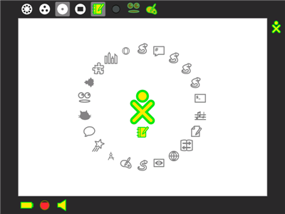
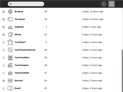
Here's a list of currently installed activities. Your favourite / starred items will show up on ring on the home view.
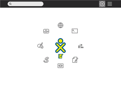
The home view on my newly-installed XO is slightly less crowded than on the the demo-machine.
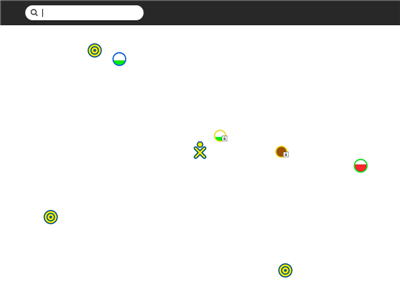
The most obvious improvement on the neighborhood view is that mesh-networks are now visually different from regular access points. Very useful for the black-and-white mode.
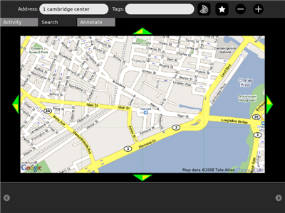
One of the highlights for me is the maps activity which is basically a Sugarized interface to Google Maps. Very cool indeed!
Opera...
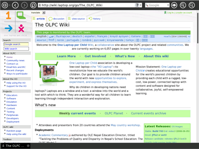
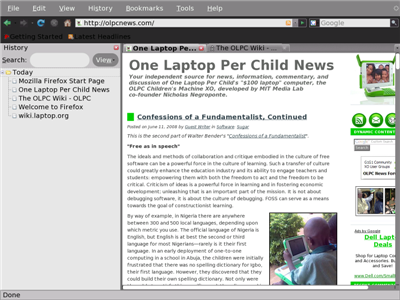
...and Firefox running on the XO.
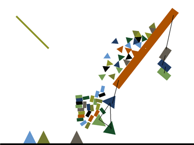
A cool physics demo.
Additionally an MPEG-4 version of Elephants Dream was shown running on the XO thanks to the power of MPlayer (OLPC News Forum has simple installation instructions).
Overall I have to say that I'm very impressed by the improvements that Sugar has seen over the past few months. While it may take some time for them to trickle down into the stable builds it's great to see into what general direction things are moving. Personally I'm currently running faster 2056 and it's a relatively smooth ride so far with the notable exception of 'record' not working. And as much as I love 'record' the improved activity startup time alone more than makes up for this loss.
Disclaimer: You will need a developer key in order to run unsigned software builds on your XO. Additionally running unsigned and potentially unstable software builds can lead to data-loss and is not recommended unless you know what you're doing. You have been warned.

I can't wait to upgrade to this, but the Record functionality is a blocker for me; it's the go-to Activity to show off the XO to people unfamiliar with it. Once that issue gets resolved I'll be switching immediately!
Thanks for the demo. But you don't need to take jabs at XP when the article is about advancements in the Sugar environment.
People are excited about windows XP running on a OLPC (windows was first released in 2001, making it seven years old)
People are also exicited about Linux running on OLPC.. Orginally released in 1991, making it 17 years old.
Wow.. OLPC can run a 17 year old OS and a seven year old OS. I'm truely impressed. Both OS's are updated and shouldn't just look at the orginal launch date and say it is old.
Yeah, I'm running faster-2056 as well. The recent builds are always a little flakey when it comes to stability, as is expected, but the new features always offer pleasant surprises. The GUI for the control panel is nice, and definitely has room for improvement (and already is!).
If anyone wants to stay current with the software development, just sign up for the OLPC community web digest (once a week, ish) and the sugarlabs digest. Nice email updates are always fun to read about the latest development.
I haven't been able to get the Tamtam suite (nor a lot of other software) running in the latest joyride or faster builds, and some stuff is buggy (record will record one frame when I switch between the picture/video tabs, and freeze if I try to actually record). It's to be expected, I suppose :P
My main laptop's LCD died, and I had to quickly turn my XO into a better "desktop" machine, so I installed xubuntu. I honestly haven't been happier with my XO since, but the new sugar stuff is always tantalizing me to pull out the USB flash drive and return to sugar.
i am not still sure how i feel about the lower frame being left with only status icons, and if the circle is enough for handling all aplications, but then i am not an user.
but it's good to read this kind of news..
So it looks like they've kept a bunch of annoying UI features:
1) the pop-up frame
2) circular layout for icons
3) the journal as exclusive access to storage
4) randomly organized display of wireless networks (why not sort by signal strength? and make the name visible all the time?)
Broken a bunch of the cool stuff:
1) Record
2) Tam Tam
And changed stuff that didn't need to be changed:
1) Active activities in the home view vs. the pop-up frame
While addressing technology issues:
1) Boot speed
2) Compatibility with other browsers
And ignoring things that will make the OLPC more useful:
1) Ability to run regular Linux apps without changes
2) Better intercommunication with computers that are not OLPCs
Gian, the source is available so you can experiment with your listed suggestion.
"Gian, the source is available so you can experiment with your listed suggestion."
That's nice, but let's be realistic: understanding an ongoing, complex project well enough to be able to make changes to it takes a looooong time, especially when the documentation is not complete, and the project is still undergoing major changes.
I care (just) enough about the OLPC project to spend hours getting it to work, teaching kids to use it, and buying the darned things.
I don't care enough to spend months or weeks deciphering the source (in C and Python) to make my own changes, which may not end up in the main build. That time is better spent ditching Sugar and installing XFCE - that way any further coding efforts can be ported to millions of other inexpensive PCs running Linux, not a few thousand OLPCs.
Even the "easy" example programs on the OLPC, written in Python, such as the games, are pretty much indecipherable to a skilled programmer, let alone a schoolchild. (By this I mean understanding the actual Python code, not the functions of the program.) They rely on functions and UI calls which are specific to Sugar - and not documented.
The process here needs to be that the developers listen to the users, and implement changes, not "if you think you can do better, go ahead".
@gian
dude...give them some time. operating systems take a long time to develop, and it taes evenloger when you have virtually no money, short handed on staff, and are trying to develop a revolutionary OS for a first of its kind laptop.
if you know programing, and care as much as you say, i wish you would help. as you say,there is a huge lack of doumentation when it comes to the xo, and proper documentation would make it substancially easier for people to contribute to the project. now i dont know how it all works, but if its basically a one time project that would simply need minor modifications here and ther ealong the way, i think it would be really swell of you to at least give it a shot. i understand nt wanting to try and make a better OS all by yourself, but if you could help with the documentation, then hopefully someone else can come along, give it a shot, and create something that you'll really like.
Three reasons why I'm not interested:
1) I DID try to document what I learned: http://www.villamil.org/?page_id=105
2) Developing a new operating system was just not necessary. Libraries for collaboration and such could have been made portable across other Linux distros, not tied to such a specific platform. Development efforts could have been focused on porting Ubuntu Mobile, XFCE or any of a number of other UIs in a good way.
3) I really detest the Sugar UI: the more I experience it, and the more I see children dealing with it, the more I hate it.
Some examples:
A) The wireless network connection screen: what is the most important info you need when connecting to the wireless network? The name, and the signal strength. Both of these pieces of information are obfuscated in the Sugar connection screen - network nodes and mesh nodes are scattered randomly about the screen, and you can only see the name when you hover over it. Laying this screen out as two columns (one for Internet connections, and one for other OLPCs), sorted by signal strength, would be boring, but much more usable.
B) Absence of text in the main UI screens: supposedly to make it easier to use multiculturally. However, other apps *require* reading - even the simple ones, and having BOTH text and graphics present is a useful tool for literacy!!! This is a TEACHING tool - having a text label in addition to the graphic UI elements would be a great way to promote learning. Instead, the text is hidden, if present at all. Watching my niece use my computer, I realize that she is actually learning, by associating text labels and menus with what they do. This is not present in the main Sugar screens.
C) Generally ill-conceived program design: I'll take the Paint program as an example, because this is one that you'd think children would take to quickly. Guess what: when you start, you can't see how to draw shapes and things. Why? Because the menus along the top of the screen are MODAL! You need to click on the top line menu to see the sub items. The top line menu items contain no graphic or visual cues! Just words!
MacPaint, already in 1984, had a great solution to this: the drawing tools are always visible, in a floating palette along the side. Windows Paint has this. TuxPaint has this. Sugar Paint, in contrast, hides the drawing tools... This kind of wilful disregard of conventions that have worked well (with children!) for over 20 years is the kind of stupidity that puts me off Sugar as part of the OLPC experience.
Moreover, once a child figures out how to draw, they get excited, and start scribbling away, often moving the cursor to the edge of the screen, at which point -- the pop-up frame! Which in this context, is totally disruptive and unexpected. Also - say the child wants to change the color with which they are painting: miss the color swatch by a few pixels, and boom! pop-up frame again.
Say the child gets bored and wants to start a new painting - no obvious clear option! Either laboriously erase the painting with the paintbrush or a rectangle, or exit and restart the Paint program (slow).
D) Choice of software more driven by gee-whiz factors than by pedagogical needs: As I've pointed out before, here is a system with no fewer than THREE programming environments (Python, Smalltalk (via Squeak) and Logo) - but no built-in documentation, and no typing tutor! How on earth is a child going to figure out Pippy? Trial and error? The TamTam suite, however, seems much better resolved - other than the modular synth, trial and error works pretty well.
Note that I haven't even addressed implementation issues: speed, reliability and such. I think the design itself is so ill-conceived that even a good implementation would be a failure.
Children are not stupid. They want to learn. My experience of Sugar is that it gets in their way.
gian, most of your comments are right on, and they are all on our list of things to work on (well, most of them). But it takes time, and it takes more time if we don't get help. If you (or others reading) want to help, pick one item on your list & work on it. Paint is a good example -- we have a new UI design for Paint (http://wiki.laptop.org/go/Designs/Toolbars#11) but no one has time to implement it right now.
I've given talks on the "non-sugar app interoperability" front (http://download.laptop.org/content/conf/20080417-fisl09/cscott/fisl08.pdf ) and it's something we're working on, but it takes time.
There is a list view for the "networks" screen which would answer your question there but (guess what?) we haven't been able to get it implemented yet.
Sugar now installs via the native package manager on Fedora, Debian, and Ubuntu, so we're making progress on integrating our libraries with other distros as well.
We've got people working this summer on the "built-in documentation" -- that is, an activity, like the one on Palm OS and other systems -- which guides you through learning how to use the XO. It could use your help (post to devel and look for Seth Woodworth).
I've wanted "typing tutor" and "learn to write" activities on the XO for a looong time, but my wanting hasn't made it so. Someone has to sit down and write (and maintain!) them.
I've been spending effort on speed and size recently, but that's another battle of percents: if I can keep shaving 5% off speed/size every week, eventually we'll get somewhere. But I could use help.